Assignment 3
My Plan
I honestly didn't have a plan for this assignment, I was too busy with work. So I took pictures of my sister again. I might re do this project. I want take pictures of the construction across from my eyes.
My Shoot
For my shoot I had my sister lay on the floor, look through the railing and play the piano. I had her do all these things because they're all neutral. She also was wearing a pepper white hoody and has blonde hair so it all works out super good. Her glasses are also like a tan clear. I might re-do this assignment later, I don't really like what I came up with, but once again I was super busy and didn't really have time to take pictures or think of what to even shoot.
My Edits


I really like my first two edits, but not my second two. I wanted to do something different instead of just portraits like usual but I don't like how they turned out. I like the idea of them, like playing instruments but the photos did not turn out like what I had in mind. But, that's alright. I keep using this preset in Lightroom called "soft mist" and I really love it. It makes my photos look soft and it really brings out the neutral colors.
Final
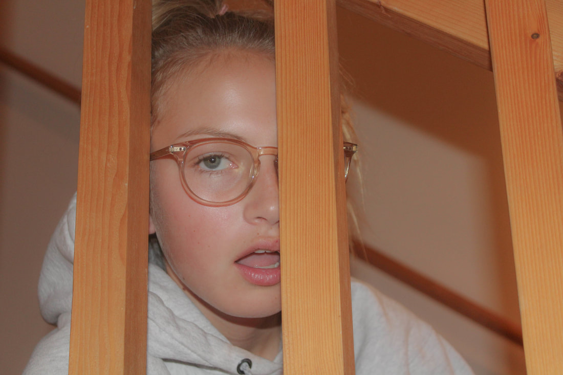
This photo is a photo of my sister sitting on our stairs. I took the photo through the railing. She is looking at me with her mouth open and she is wearing her glasses. In the frame you can only see her face and the tops of her shoulders. An element of art in this photo is line. Line can be seen with the railing in front of her face but also the one behind her. There is also line inside of the railing, you can see the details in the wood. A principle of design used in this photo is perspective. Perspective is used in the way that I took the picture, through the railing. Also the railing blocked one of her eyes. The purpose of this photo was to go with the theme of my portfolio which is neutral colors. I think that it accomplished the purpose because of the color of the railing, her skin and hair. The mood of this photo is like "I'm done". I really like the way the mood can really be seen through the photo. Even though I didn't really like what I did for this project, I really like the way this photo turned out. I like how it looks fuzzy almost and I think it goes with my portfolio well. One thing that could improve is the fact that I now have two projects of Carter, so I should do something different next time.
